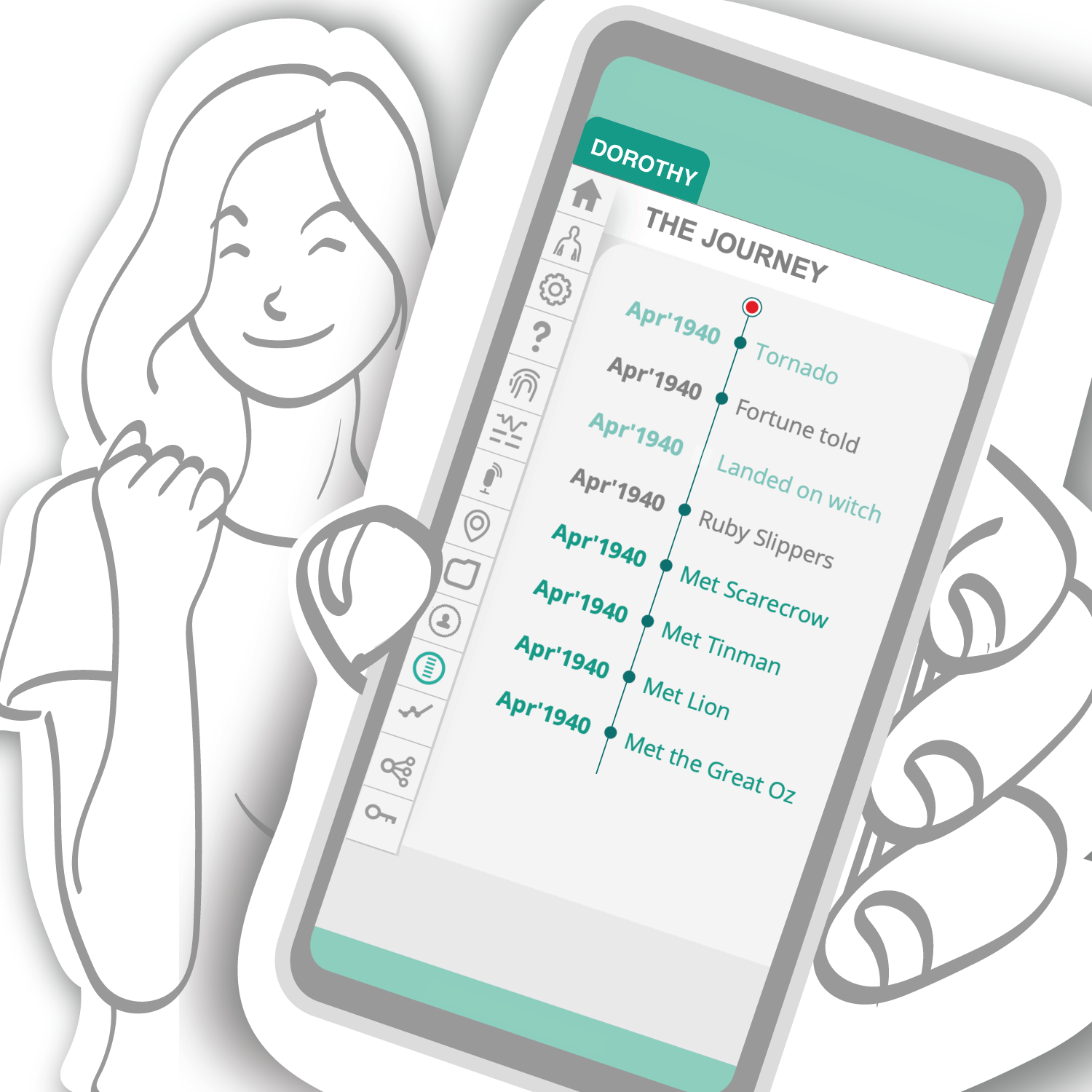
Client: My Health Story (personal project) Brief: Social media and advertising material for a system inviting individuals to communicate their health journeys by creating a personalised (private) health story that can be shared with health teams or used for care. Outcome: Various media for various advertising platforms. Illustration credit. myhealthstory.com.au Melbourne Design Week finalist, 2026 [...]
University of Canberra: Active Beginnings Animation
soula2024-05-21T13:24:59+10:00Client: University of Canberra Brief: A short animation communicating the benefits of exercise during pregnancy, specifically targeting women in multicultural communities. Outcome: Multi-cultural characters across all age groups were captured in a sketchy and simplistic 'paper cut' style and collaged with photographic elements to present key factors and helpful information relating to the benefits of exercise throughout pregnancy. [...]
Queenscliff Historical Museum Exhibition Design
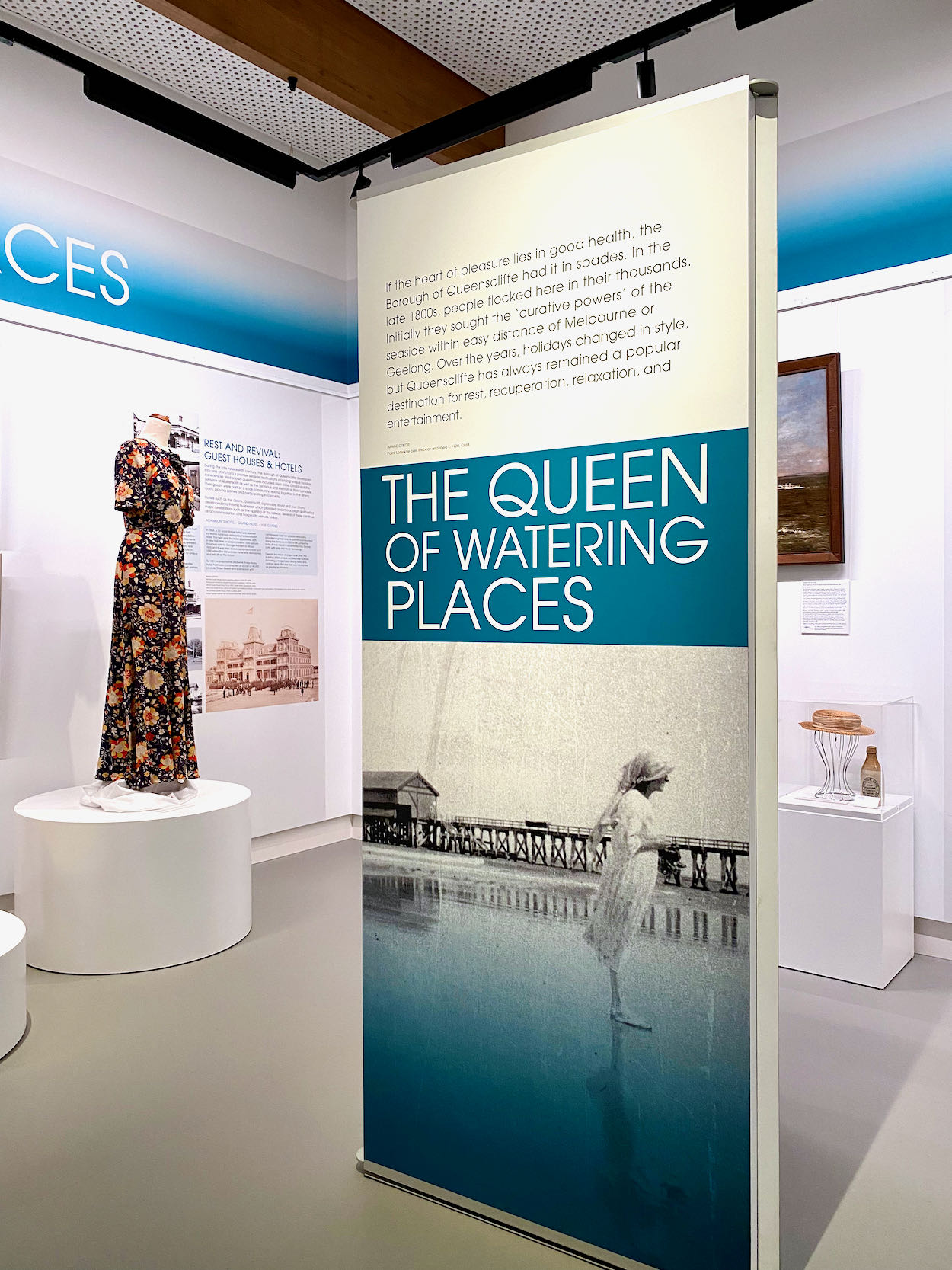
soula2022-10-08T12:33:21+11:00Client: Queenscliff Historical Museum Brief: Concept, design application and style guide for three stories forming the historical exhibition space. Outcome: The story of the Borough of Queenscliffe, curated by Lesley Alway, was presented in three themes; Origins and Environment, Creating Community and The Queen of Watering Places. The Queenscliff Historical Museum forms part of the newly built Wirrng Wirrng hub [...]
Moving Pictures Dementia Awareness Animation
soula2026-03-21T10:58:01+11:00Client: Moving Pictures, Australia Raising awareness of dementia in people from culturally and linguistically diverse (CALD) backgrounds. Families & Informational Brochures Brief: Design of family characters of Arabic, Cantonese, Hindi, Mandarin and Tamil families. Application and design of multicultural and bilingual brochures. [...]
Neami National Annual & Service Improvement Reports
soula2022-05-04T13:54:54+10:00Client: Neami National Brief: Concept and layout of the two reports incorporating the theme 'Working Together' Outcome: A graphic solution using the organisation's colour palette that represents the positive outcome and achievements of Neami National's collaborations
St. Vincent’s Resource booklet
soula2022-05-04T13:56:28+10:00Client: St. Vincent’s Hospital Melbourne Brief: Victorian Dual Diagnosis Initiative: Education and Training Unit training manual, and The Relationship Between Alcohol & Drugs and Mental Health - A Resource Book for Aboriginal Workers Outcome: Spiral bound manual and 8 page booklet (recently expanded to 12) incorporating the artwork of Joanne Dwyer.
Neami National’s Health Prompt
soula2022-05-04T13:56:54+10:00Client: neaminational.org.au Brief: Design of Sustainability and Health Prompt banners, Health Prompt booklet, poster and Dl pamphlet. Outcome: Material for the organisation’s official launch of Health Prompt, an education resource for staff and people needing health support. Photo: Neami National CEO, Arthur Papakotsias and Theo
The French Experience
soula2020-12-02T13:44:26+11:00Client: The French Experience, a tourist accommodation business for visitors travelling to France Brief: To design an identity that incorporated TFE Director's favorite symbol, the 'li', apply to stationery and also present promotional material for visitors who book with the company. Outcome: After creativng the identity, we drew a series of Paris monuments that were used as secondary graphic elements [...]


